
Transplanting Brand Identity onto Dielines: Composition Over Skeleton
Re-skinning a beverage dieline exposed the danger of confusing layout skeletons with functional geometry. How OMNI DEATH reclaimed its negative space.
Key takeaways
- Deriving brand palettes from front-end stylesheets risks mistaking UI alert tokens for authentic brand identity colors.
- The true OMNI DEATH palette couples metallic gold (#c8a24a) with void black (#060607) and bone white (#e8e6df).
- Packaging transplantation transfers only functional geometry—bleed boundaries, safe zones, and barcode positions—never composition.
- Blindly inheriting template skeletons crowds minimalist brands; OMNI DEATH requires vast negative space and a single central icon.
- Adobe Illustrator COM automation enforces read-only app.Visible properties and imports outlined vector logos as CompoundPathItem.
The fallacy of visual inference from source code tokens
When engineering automated design workflows, developers frequently commit a subtle cognitive error: assuming that an organization's software repository contains an accurate, self-contained definition of its brand identity. In digital-first creative agencies, brand assets, interactive web apps, and automated rendering scripts coexist within shared version control. It is tempting to believe that one can discern a brand's visual essence simply by parsing CSS variables and component declarations.
On 2026-06-13, our studio initiated an automated re-skinning project to adapt an existing 250ml slim beverage dieline into packaging for OMNI DEATH canned sparkling water. Tasked with establishing the visual palette programmatically, an automation pass inspected the brand's landing page codebase. The parser discovered prominent style tokens: `data-blood`, `body count`, and distinct crimson highlights styled under `cmp__mark--bad` using hex codes `#ff4040` and `#8e1111`.
Operating purely on code inference, the pipeline synthesized an initial label dominated by brushed gunmetal plates and aggressive blood-red typography. When the draft was reviewed by the creative director, the response was immediate rejection: the studio's canned water was never red. Investigating the stylesheet architecture revealed the mistake: the crimson hex codes were exclusively game-state variables within an interactive 3D browser mini-game, indicating damage, low oxygen, and player death. The automation script had mistaken ephemeral UI danger states for foundational corporate brand identity.
The canonical palette: gold, void black, and bone white
Establishing the authentic visual language required stepping away from scattered frontend tokens and consulting canonical product masters. The authentic OMNI DEATH palette is built upon severe, ritualistic restraint. Rather than aggressive distressed crimson, the brand communicates luxury through metallic gold (#c8a24a), void black (#060607), and stark bone white (#e8e6df).
The deep void black serves as an absolute optical floor, absorbing ambient light across the cylindrical aluminum surface. Metallic gold is applied with precise, surgical restraint, catching specular highlights on typography and structural framing. Bone white is reserved strictly for legal regulatory text, nutritional compliance statements, and barcoding.
| Design Dimension | Inherited From Template (GIMMI 250ml) | Rebuilt For New Brand (OMNI DEATH) | Production Role |
|---|---|---|---|
| Can Dieline Dimensions | 250ml aluminum cylinder | Identical functional cut boundaries | Physical manufacturing compliance |
| Print Safe Zone & Bleed | 3mm bleed margins, 4mm safe margins | Identical safe boundaries maintained | Prevents mechanical trimming errors |
| Mandatory Regulatory Blocks | Barcode box, volume mark, recycling | Repositioned into discrete back column | Meets legal beverage packaging standards |
| Surface Composition | Dense wave graphics, side callouts | Expansive void black negative space | Establishes minimalist luxury identity |
| Central Graphic Element | Dual nutritional and flavor tables | 1 central gold skull-and-droplet icon | Unmistakable focal hierarchy |
| Typographic Hierarchy | Multiple competing slogan banners | 1 horizontal gold wordmark at top | Clean architectural legibility |
This palette reflects the brand's underlying conceptual thesis: treating canned sparkling water not as everyday consumer hydration, but as a hyper-minimalist memento mori. Attempting to deduce this philosophical aesthetic from frontend CSS was impossible; brand color is a deliberate editorial commitment that must be grounded in physical product ground truth.
The template skeleton trap and compositional crowding
Even after correcting the color palette, our initial automated packaging pass suffered from a deeper structural failure. The engineering workflow was configured to execute a direct asset swap onto an existing GIMMI 250ml beverage template. GIMMI's packaging layout was a dense, hyper-energetic composition: rhythmic wave patterns, multiple diagonal claim badges, secondary marketing claims, and side-by-side nutritional grids.
The automation script dutifully preserved this structural skeleton, merely recoloring the shapes from blue to gold and replacing the text strings. The resulting prototype was a disaster. While it utilized OMNI DEATH's colors, it completely betrayed OMNI DEATH's soul. Forcing an austere luxury brand into a noisy consumer-packaged-goods grid produced a cluttered, chaotic label that looked like an energy drink parody.
When transplanting a brand onto an existing dieline, only functional geometry transfers; the composition must be completely reinvented. The functional geometry consists solely of physical manufacturing constraints: total dieline width, cylindrical wrap circumferences, bleed zones, trimmer tolerances, barcode placements, and mandatory deposit marks. Composition—the allocation of negative space, typographic hierarchy, and visual weight—belongs entirely to the brand and must never be inherited from the donor template.
The purity of negative space and single-symbol hierarchy
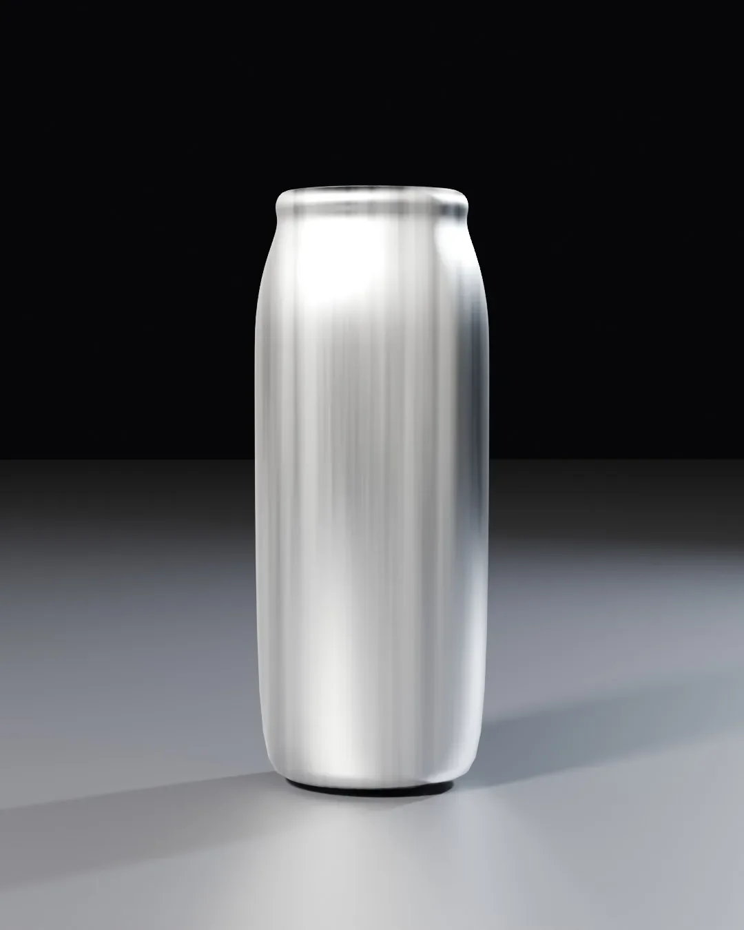
The definitive OMNI DEATH label was achieved by stripping away every decorative element inherited from the GIMMI skeleton. Realizing that the can's cylindrical form factor naturally warps horizontal layouts, the composition was rebuilt around radical vertical symmetry and expansive void space.
The front facing features exactly three architectural elements. At the top crown sits 1 horizontal gold wordmark: 'OMNI DEATH', set in restrained serif capitals within a delicate hairline gold border frame. Anchoring the optical center of the cylinder is 1 large gold emblem: the iconic skull-and-droplet crest, rendered in flat metallic vector foil. At the base of the front panel, separated by vast negative space, sits two quiet lines of typography: 'SPARKLING WATER' and 'DROWN YOUR THIRST'.
All mandatory regulatory information—ingredients, volume measurements, recycling symbols, and the GS1 barcode—was consolidated into a disciplined, narrow vertical column on the reverse seam. By clearing the front face of all visual noise, the packaging transforms a standard mass-produced beverage can into a stark, sculptural monolith that commands immediate attention on retail shelves and editorial lookbooks alike.
Technical automation traps in Adobe Illustrator COM
Translating this refined design into automated pre-press production exposed critical differences between desktop creative applications. While Photoshop's COM automation interface allows scripts to set `app.Visible` dynamically to monitor rendering passes, Illustrator COM 30.5.1 treats `app.Visible` as strictly read-only. Scripts attempting to alter visibility throw immediate runtime exceptions.
Furthermore, handling vector brand assets programmatically revealed object model traps. Graphic designers routinely convert commercial logos into vector outlines to prevent font substitution errors during commercial printing. When an automated script parses an Illustrator document searching for `doc.textFrames`, outlined logos are completely invisible to the query. In Illustrator's Document Object Model, outlined vectors exist as `GroupItem` or `CompoundPathItem` instances.
To automate label reskinning reliably, our pre-press scripts execute geometric bounding-box sweeps. The automation routine inspects all compound path items, identifies logo boundaries based on aspect ratio and spatial coordinates, and executes surgical layer replacements. Automated pre-press pipelines must accommodate the physical realities of both vector document architectures and brand composition, proving that true automation requires deep respect for visual art direction.